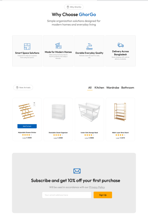
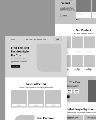
Wireframe
/// UI & Landing Page Design
I design high-converting Figma landing pages and interfaces built around how real users scan, decide, and act. Strategy, copy, and design from one person, so nothing gets lost between the wireframe and the final screen.

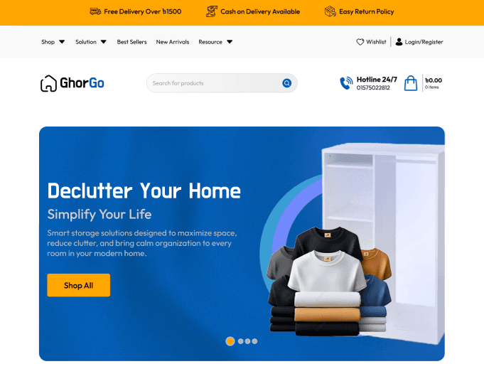
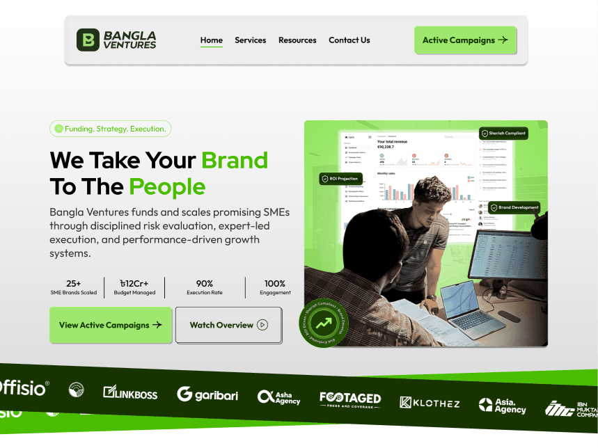
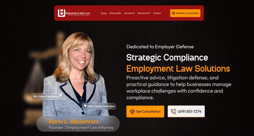





Most design work gets handed off by someone who never wrote the copy or thought about the goal.
So you end up with a page that looks sharp but has no strategy behind the layout, or copy that was squeezed into a template after the fact. Then a developer tries to stitch the two together and the flow breaks again.
That's how you get pages that win awards and still don't convert, or pages that convert fine and feel generic. The gap isn't talent. It's the handoff.
I write the copy and design the page it lives on, so the message and the layout come from the same read of your audience, not two separate people guessing at each other's intent.

/// WHAT YOU GET
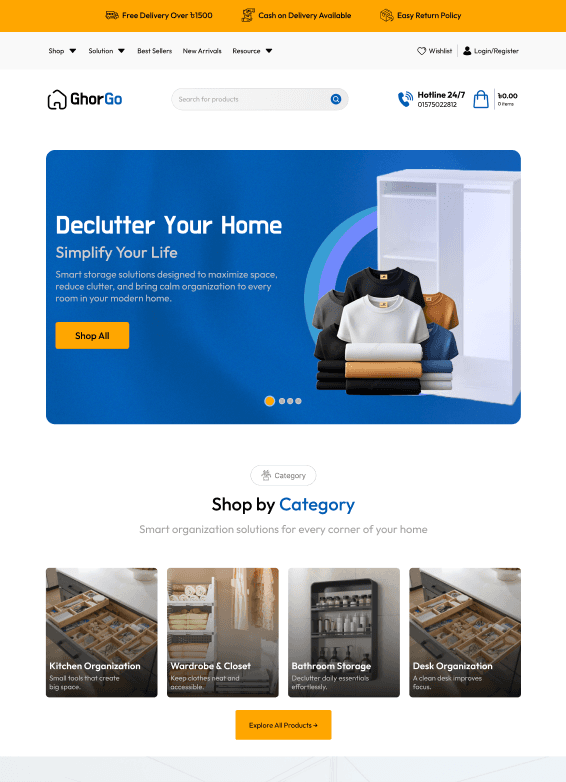
/// Why My Design
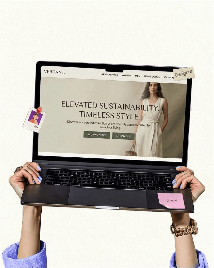
People don't read a page top to bottom, they scan for the next answer. I design the visual hierarchy so the eye lands on the hook, the proof, and the CTA in the order that moves someone toward action.
No filler blocks added just to fill space. Each section has one job, whether it's building trust, handling an objection, or pushing to the next step, so the page stays focused and fast to grasp.
I write the copy, design the Figma layout, and prep the front-end build. Nothing gets lost in translation between a separate writer, designer, and developer. What you approve is what ships.
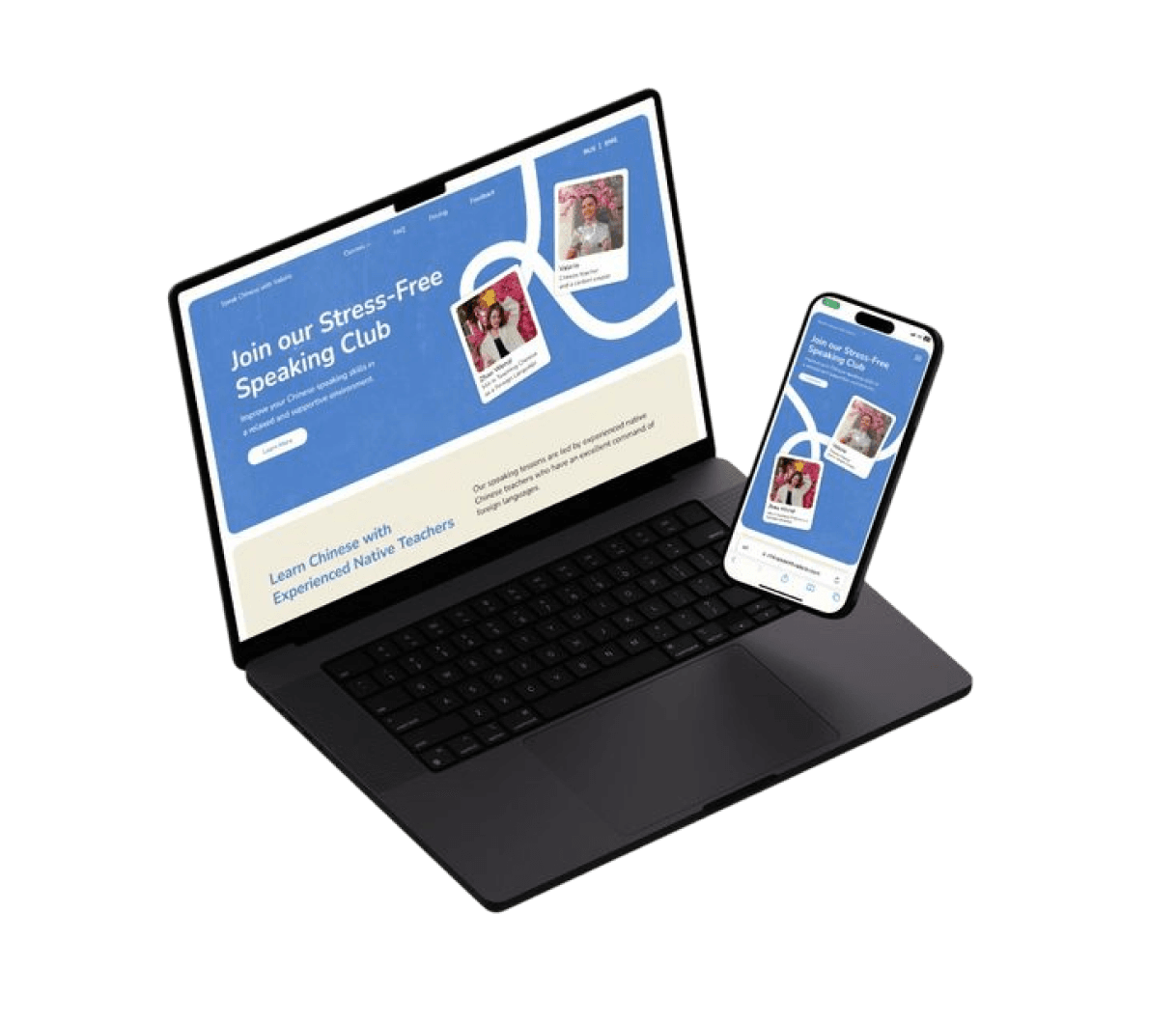
Most of your traffic is on a phone, so I design the mobile experience first and scale up. Tap targets, spacing, and flow are built for a thumb, not squeezed in at the end.
Launching is step one. I review heatmaps, scroll depth, and conversion analytics after go-live, then refine the layout, hierarchy, and CTAs so the page keeps getting better over time.
/// Who I Design For
The work suits businesses with a product or offer already in the world, where the design decision is about clarity and conversion rather than picking a look.
Marketing sites, pricing pages, and the screens behind the login. Both halves usually drift apart because different people made them; designing them together is what keeps a product feeling like one thing.
Companies that need a designer's judgement without a full-time salary attached. Typically a site, a set of components, and enough system that the next person can carry it forward.
Landing pages built for a specific ad or audience, designed so the next campaign is a variation rather than a fresh brief every time.
Overflow design work for agencies with more sold than staffed, delivered in files their own developers can build from without a translation call.
Traffic arrives and leaves. Usually the layout is fighting the message rather than carrying it, which is a design problem wearing a copy problem's clothes.
/// My Design Process
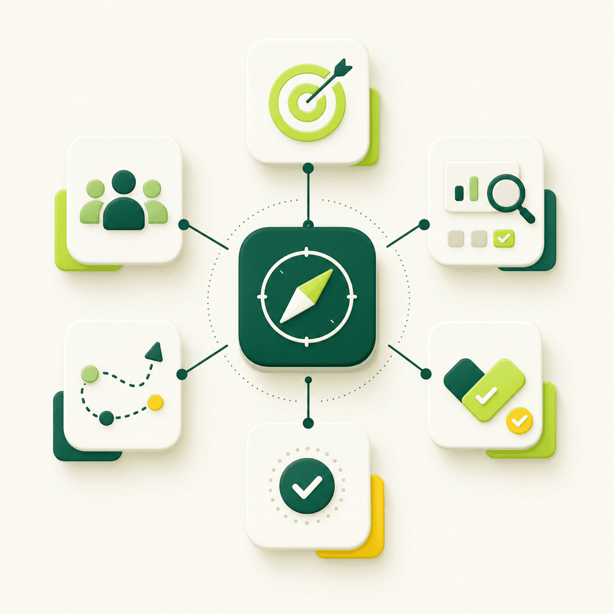
Before a single frame gets designed, I dig into your goals, your audience, and the action you want visitors to take. I audit what's working, map the user journey, and align on the one job the page has to do. You approve the direction before I open Figma.
Now I structure the page. Low-fidelity wireframes lock in the layout, the section order, and where every message and CTA lives, before any color or polish. You review the skeleton so we agree on flow before we spend time on visuals.
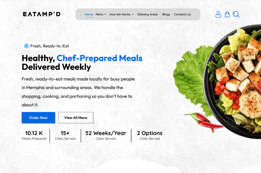
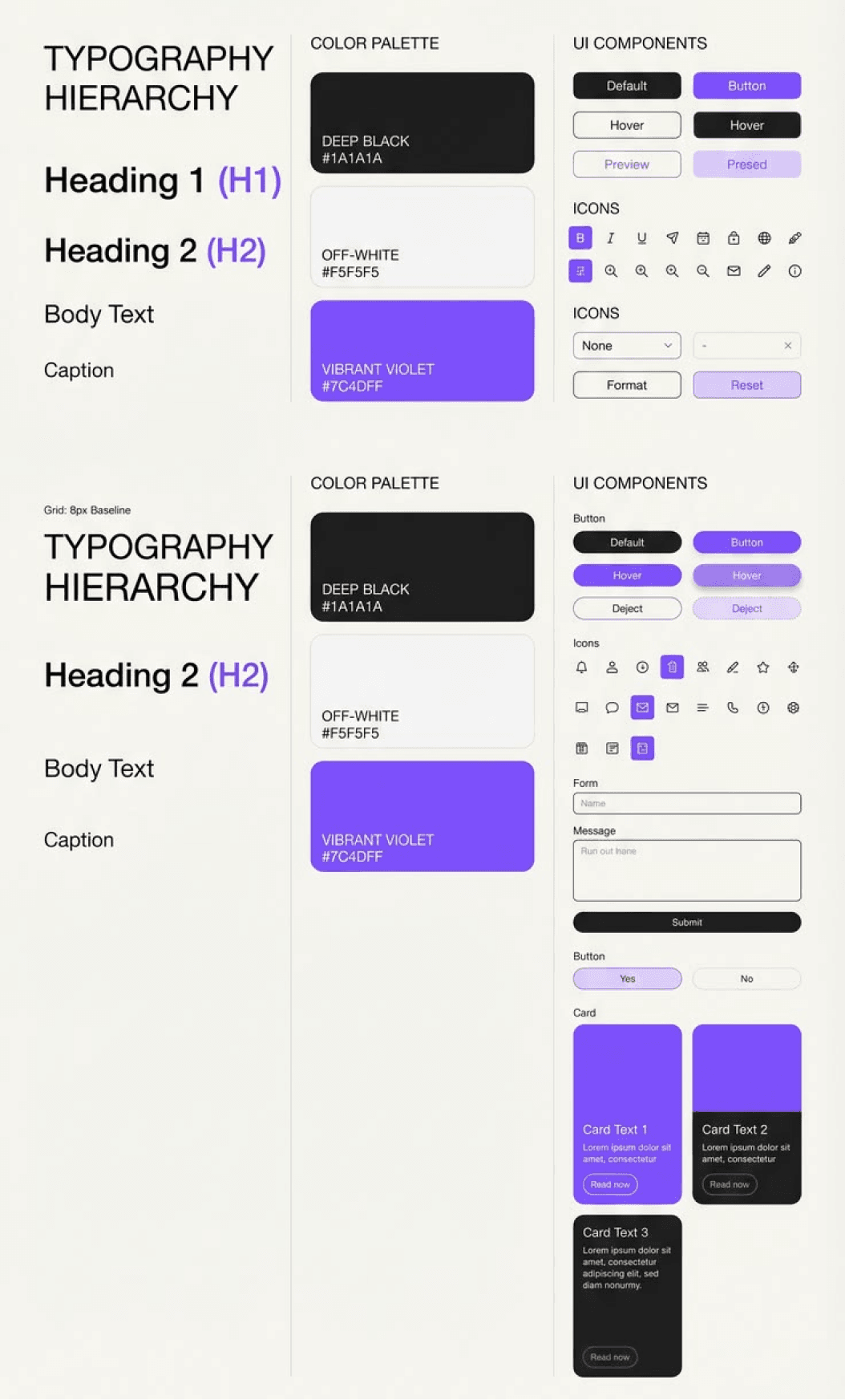
The approved wireframe becomes a polished, on-brand interface in Figma. Typography, color, spacing, and imagery all reinforce the message and point to the CTA. Built on a component system so every screen stays consistent.
I turn the design into a clickable prototype so you can feel the flow before build, then package developer-ready specs, tokens, and assets. What you approve is exactly what goes to development, with nothing lost in translation.
/// What I Won't Do
Great design is as much about what I refuse to do as what I deliver. These are the shortcuts I turn down, keeping your product clear, usable, and built to convert for the long run.
I don't reskin a marketplace template and call it custom. Every layout is designed around your message and audience, so the page fits your goals instead of forcing your content into someone else's box.
Pretty is not a plan. I never start pushing pixels before we're clear on the audience, the goal, and the one action the page should drive. Strategy comes first, visuals follow.
A design that looks stunning but confuses users has failed. I won't sacrifice clarity, accessibility, or flow for a trendy effect. Every choice has to help the visitor move forward.
Layout and words are one decision, not two. I won't design around placeholder text and hope real copy fits later. The message and the design are built together from the same read of your audience.
Years of experience
Repeat clients
Interfaces designed
Landing pages shipped

/// What You Receive
A design is only finished when someone else can build it exactly. Most of what goes wrong between design and development is not disagreement — it is a spacing value nobody wrote down.
Pages and layers named for what they are, not Frame 47. Anyone opening the file in a year should be able to find the thing they want to change without excavating.
Hover, focus, disabled, loading, empty, and error. The states left undesigned are the ones invented during the build, which is where an interface starts looking assembled rather than designed.
Buttons, cards, forms, and sections built as reusable components, so changing the button once changes it everywhere instead of in forty places.
A defined scale rather than values chosen per screen. This is what makes the built site match the design instead of approximating it.
How each section reflows at tablet and mobile, decided in the design rather than guessed at during the build by whoever is closest to the deadline.
Icons, images, and measurements ready to use, so the build starts with what it needs rather than a request for it.
Most agencies split your project across a researcher, a UI designer, and a developer, and the strategy leaks at every handoff. I handle the entire chain myself, so your interface is researched, designed, and structured to guide users and convert them once they land.
User-First Research
Conversion-Focused Layouts
Reusable Design Systems
Developer-Ready Handoff
Interfaces Designed
Avg. conversion lift
Happy Clients
Industry
/// What I Design
High-intent landing pages built to convert one audience for one campaign. I match the design to the ad or message that brought the visitor in, then structure every section to move a single clear action forward, no distractions, no dead ends.
/// Project Scope
Design work is quoted on what has to be drawn and decided, not on a package. One landing page and a product interface with forty screens are different projects wearing the same job title.
Unique layouts, not page count. Twenty pages sharing three templates is a smaller job than five pages that share nothing.
Building tokens, components, and documentation costs more upfront and less on every screen after it. Worth it if there will be more screens.
Motion, transitions, and micro-interactions have to be designed and specified. Static comps are cheaper; the site feels it.
Whether the work starts from an existing brand or has to establish one, and how many concept directions you want to see before committing.
Whether the project ends at approved files or includes staying available while a developer builds it.
Testimonial


I have had a great experience working with him. We were working on a project about a saas app. He played a good role in the collaboration of copywriting and UI design. Recommended.
Founder, GoalFlow


We needed a website UI for Bangla Venture that looked professional and guided the user without friction. Hamidul, nailed the visual hierarchy. It’s a pixel-perfect design that perfectly captures what Bangla Ventures stands for.
Founder, Banglaventure


Titas joined the Growminion team to handle writing and design for our local SEO clients. He consistently delivers high-quality work, and we’ve had a fantastic experience working with him.
Founder, Growminion

Titas helped us design a product landing page for Peanela, and the experience was excellent. He understood our requirements clearly, delivered a clean and professional design, and maintained great quality throughout the project.
Managing Partner, Peanela

Got Questions?
Yes. Every project is designed in Figma with auto-layout, components, and variants, so you get an editable, organized file, not a flat image you can't build from.
Both. I write the copy and design the page it lives on, so the message and the layout come from one read of your audience. Nothing gets lost in a handoff between a separate writer and designer.
Absolutely. I can design within your existing brand, extend your current design system, or build one from scratch if you don't have one yet. Either way the result stays consistent and on-brand.
Yes. You get a clean, documented Figma file with spacing, tokens, states, and exported assets, plus a clickable prototype, so your developer can build exactly what was approved.
Most single landing pages take one to two weeks from discovery to handoff, depending on scope, content readiness, and revision rounds. Multi-page sites and product UIs take longer.
Yes. I design the Figma layout and can develop the front-end with modern, high-performance code, so what you approve in design is exactly what goes live.
Blogs