Dummy Logo Sections – 5 Modern Layout Variations
This collection includes five modern client, partner, and company logo section variations designed for agencies, SaaS companies, startups, consultants, technology platforms, and professional service websites. Each variation presents brand logos in a different layout, allowing businesses to display social proof without repeating the same visual pattern throughout a website.
Client logos are often one of the fastest ways to establish credibility. Before visitors read detailed case studies, testimonials, or service descriptions, they can recognise the types of organisations that have already trusted the business. A well-designed logo section quietly communicates experience, market relevance, and professional reliability.
This component set moves beyond a basic row of logos. It includes multiple presentation styles for different page positions and content needs. One variation combines a short introduction with a bordered logo row, another uses a client-count statement above a continuous logo display, and another introduces the logos with a prominent trust-focused heading. The remaining variations offer larger logo grids and a compact worldwide-partner banner.
Because all five layouts follow a consistent monochrome visual direction, they can be used together within the same design system. Each version feels related, but every section has a different purpose and level of emphasis.
Set One: Introductory Logo Strip with Supporting Message
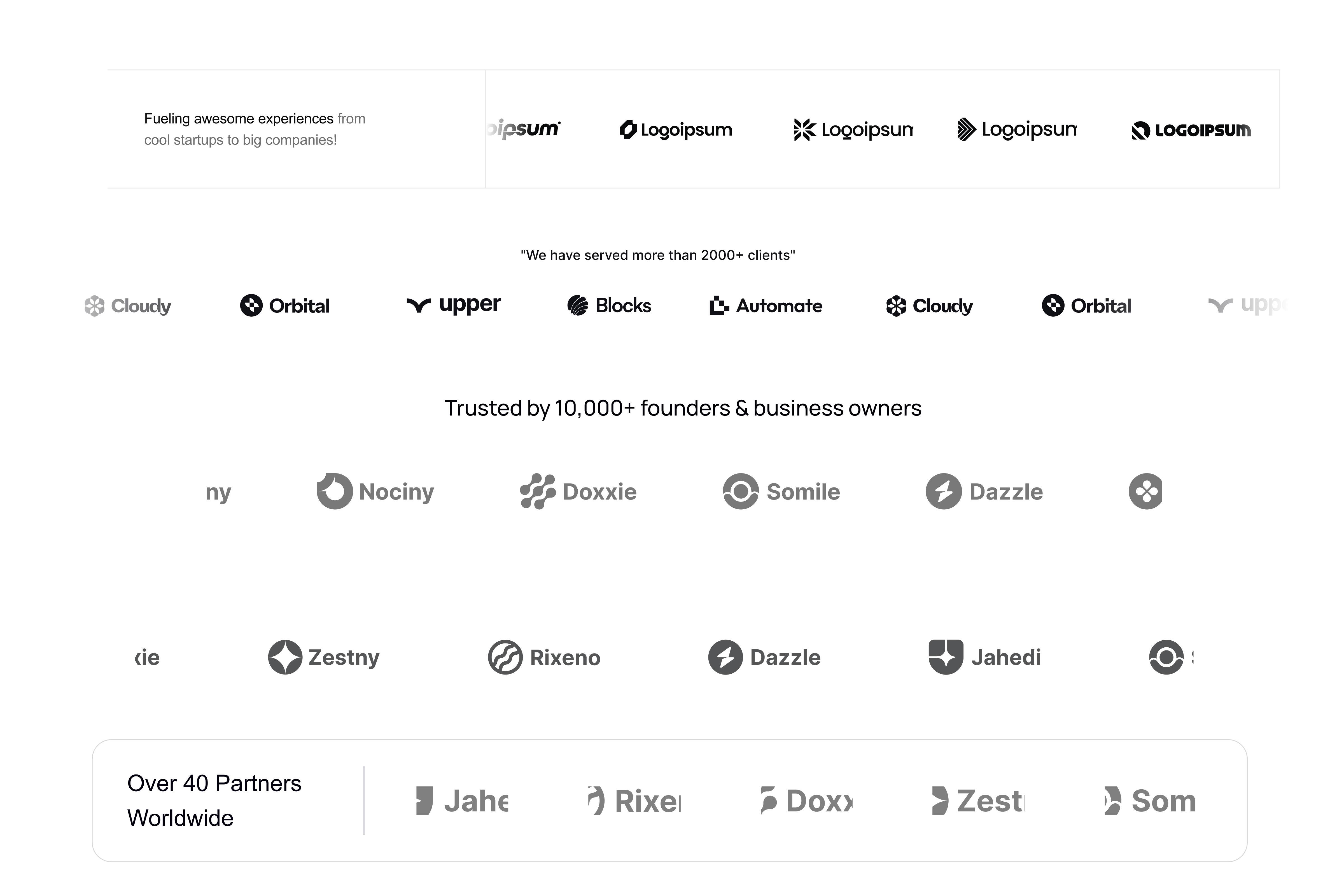
The first logo variation combines a short supporting statement with a horizontal row of company logos inside a structured bordered container. This layout is ideal for introducing social proof near the top of a landing page, especially after a hero section or product introduction.
The left side contains a compact message that can explain the relationship between the business and the displayed companies. A phrase such as “Fueling awesome experiences from cool startups to big companies” gives the section more personality than a standard “Trusted by” heading.
The remaining area is used for a clean sequence of brand marks. Thin dividers separate the introductory message from the logos, giving the component a balanced and organised appearance. The subtle border helps the section feel self-contained without making it visually heavy.
This variation works particularly well for creative agencies, development studios, design partners, marketing teams, and product consultancies. These businesses often work with companies of different sizes, and the accompanying message allows them to communicate that range.
The wording can be customised depending on the type of relationship being presented. Examples include:
“Supporting ambitious teams from early-stage startups to global companies.”
“Creating digital products for businesses of every size.”
“Trusted by teams building the next generation of digital experiences.”
The logo row may include clients, technology partners, investors, featured brands, portfolio companies, or organisations that use the product.
Set Two: Client Achievement Statement with Continuous Logo Row
The second variation introduces the logos with a small statement such as “We have served more than 2,000 clients.” This layout places the credibility claim above the visual proof, helping visitors understand the scale of the business before reviewing the company marks.
The logos are presented in a single horizontal row with generous spacing. Some logos can appear at reduced opacity near the edges, creating the impression of a continuous carousel or automatically scrolling marquee. This treatment is effective when a business has a large number of clients but does not want to display all of them at once.
A moving logo row can add subtle energy to the page while keeping the content professional. The animation should be slow and smooth, allowing visitors to recognise individual logos without creating distraction. It should also pause when users hover over the section and respect reduced-motion accessibility preferences.
This variation is suitable for established agencies, B2B software products, service platforms, outsourcing companies, and businesses with a broad customer base. It communicates quantity and reach rather than focusing only on a few recognisable names.
The supporting statement can highlight different achievements, including:
“Chosen by more than 2,000 growing businesses.”
“Powering teams across 35 countries.”
“Trusted by thousands of founders and product leaders.”
“Helping ambitious companies launch and scale faster.”
The number should always reflect real and verifiable information. When the component is used as a design template, placeholder figures can be replaced before publishing the final website.
Set Three: Trust-Focused Heading with a Spacious Logo Grid
The third layout uses a larger central heading such as “Trusted by 10,000+ founders and business owners.” Below the heading, the logos are organised into multiple spacious rows.
This variation gives social proof a more prominent role on the page. Instead of treating logos as a small supporting element, it presents them as a complete credibility section. The generous white space keeps the component elegant, while the repeated logo rows communicate the size and diversity of the network.
The monochrome treatment prevents individual brands from overpowering the section. It also creates visual consistency when the original logos use different colours, shapes, and levels of detail. The greyscale style makes the collection feel curated and allows the website’s own brand identity to remain dominant.
This layout is ideal for platforms serving founders, entrepreneurs, agencies, small businesses, and professional communities. It can also be adapted for investment firms, startup accelerators, membership platforms, business tools, and online marketplaces.
The heading can be tailored to the audience rather than using a generic client statement. For example:
“Trusted by product teams building category-defining companies.”
“Used by founders, operators, and creative teams worldwide.”
“Helping modern businesses turn ambitious ideas into scalable products.”
“Chosen by growing teams that care about better customer experiences.”
Audience-specific language makes the section feel more relevant and helps visitors identify themselves among the displayed customers.
Set Four: Multi-Row Client Showcase for a Large Brand Network
The fourth variation expands the logo presentation into a larger multi-row showcase. It is designed for businesses with a substantial client portfolio, partner ecosystem, or member network.
A larger grid provides enough room to display a wider range of organisations without crowding the logos into a single line. Each row maintains consistent spacing, alignment, and visual weight, helping logos of different proportions feel balanced.
This type of section can be placed on an “About,” “Clients,” “Partners,” or “Our Work” page. It can also appear below case studies to demonstrate that the featured projects represent only part of the company’s broader experience.
The component can include multiple categories of organisations. For example, a software company might display customers, integrations, and technology partners. A creative agency might show startup clients, established companies, and long-term collaborators. A professional network could display members, sponsors, and community partners.
When categories are mixed, small labels or filters can be added to make the relationships clearer. Visitors should not be left to assume that every logo represents the same type of partnership.
Each logo can also be interactive. Clicking a client logo could open a relevant case study, testimonial, project page, or integration profile. This turns a static trust section into a useful navigation element and gives interested visitors an opportunity to explore real examples.
Set Five: Compact Worldwide Partner Banner
The fifth variation is a compact bordered banner that combines a partnership statistic with a row of logos. The left side may feature a message such as “Over 40 Partners Worldwide,” while the right side displays selected partner marks.
This layout is especially useful near the bottom of a page, inside a partnership section, or above a final call to action. It communicates reach and collaboration without requiring the vertical space of a full logo grid.
The rounded container gives the component a modern card-like appearance. A vertical divider separates the message from the logo area, creating a clear visual structure. Logos near the edges can be partially masked to suggest that the network extends beyond the visible items.
This set is particularly suitable for global service providers, integration marketplaces, reseller programmes, technology ecosystems, supply-chain businesses, and international organisations.
The message can be adapted to different forms of partnership:
“Connected with 40+ technology partners worldwide.”
“An international network of trusted specialists.”
“Working with verified partners across major global markets.”
“Integrated with the tools modern businesses already use.”
For a local business, the worldwide reference can be replaced with regional or industry-specific language.
Designed for Real Client Logos or Neutral Dummy Brands
The collection can be used with real client logos or neutral placeholder logos during the design and development stage. Dummy logos are useful when presenting a concept, building a template, creating a portfolio case study, or demonstrating a website before final brand assets are available.
Using neutral logo names prevents the template from implying false partnerships with real organisations. It also helps viewers focus on the component’s spacing, alignment, scale, and visual hierarchy rather than the reputation of familiar brands.
When real client logos are added, they should be used only with appropriate permission. Businesses should also clarify the nature of the relationship where necessary. A customer, partner, investor, integration provider, and publication feature are not the same, so the heading should accurately describe what the logos represent.
SVG files are recommended because they remain sharp at different screen sizes. Each logo should be placed inside a consistent bounding area so that wide and compact marks appear visually balanced.
Monochrome Styling for a Clean and Consistent Appearance
The logo designs use a black, grey, and white visual system that allows many different brand marks to appear together without creating visual noise.
When client logos retain their original colours, one strong colour may dominate the section while another appears too weak. Converting the logos to monochrome gives them a consistent visual presence and supports a more refined website aesthetic.
Opacity can be used to create hierarchy. Logos in the centre can appear darker, while logos near the edges may fade slightly to suggest movement or continuation. Hover interactions can restore the original logo colour, creating a subtle moment of engagement.
The section should still maintain sufficient contrast. Logos should not be so light that they become difficult to recognise, especially on lower-quality displays or in bright environments.
Responsive Layout for Desktop, Tablet, and Mobile
Each of the five logo variations can be adapted for smaller screens.
The introductory strip in the first set can stack the supporting message above the logos. The client-count marquee can remain horizontally scrollable or continue as an animated row. The larger logo grids can reduce the number of columns while preserving equal spacing.
On mobile devices, two or three logos per row will usually provide better recognition than shrinking many logos into one line. The worldwide-partner banner can place its message above the partner marks instead of maintaining a side-by-side layout.
Automatic logo carousels should not move too quickly. Touch users should also be able to swipe the list manually where appropriate.
Spacing should remain generous enough that the logos do not feel cramped, but the section should avoid excessive vertical length on small screens.
Accessibility and Performance Considerations
Each logo should include meaningful alternative text when it represents a real company. Decorative dummy logos may use empty alternative text so screen readers can skip them.
When a logo links to a project or case study, the accessible label should clearly describe the destination. Visitors should understand whether they are opening a client story, partner profile, or external website.
SVG logo assets should be optimised before implementation. Large image files and unnecessary animation can reduce performance, especially when several rows are displayed.
For animated marquees, the experience should stop or simplify when reduced-motion preferences are enabled. A static responsive logo grid can serve as the accessible alternative.
A Reusable Social-Proof Collection for Modern Websites
These five client and partner logo sections offer more flexibility than a single reusable logo row. Each variation supports a different stage of the visitor journey.
The introductory strip works well near the top of a page. The client-count marquee communicates scale. The trust-focused grid gives social proof greater prominence. The multi-row showcase presents a large network, while the compact partner banner creates a polished closing element.
Together, the five sets can support agency websites, SaaS landing pages, startup portfolios, corporate websites, partnership programmes, integration directories, and professional service platforms.
The collection allows designers to choose the right level of emphasis for each page while maintaining consistent spacing, typography, borders, and monochrome logo styling. This makes the component useful both as a complete logo-section package and as a flexible foundation for custom client, customer, sponsor, integration, or partner showcases.