Regenerative Finance and Green Fintech Hero Section
This regenerative finance hero section is designed for green fintech companies, carbon credit platforms, climate investment products, environmental payment solutions, and sustainability-focused financial startups. It combines the trust and clarity expected from a financial product with the calm, natural visual language of an environmentally responsible brand.
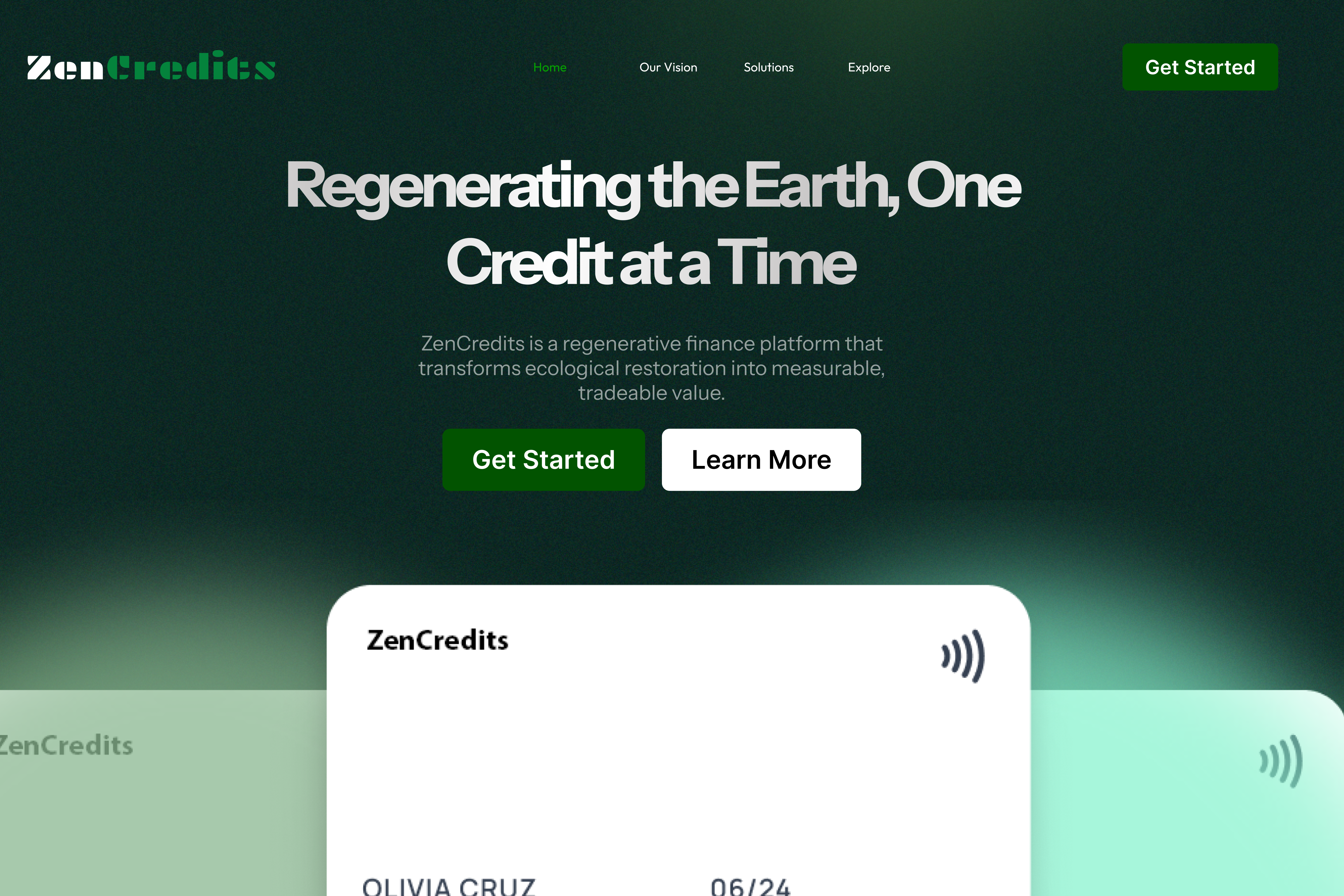
The layout introduces a platform that turns ecological restoration into measurable financial value. Rather than presenting sustainability as a secondary brand message, the design places environmental impact at the centre of the experience. The headline, colour palette, supporting copy, navigation, and product preview all reinforce the idea that finance can be used to restore ecosystems while creating transparent and tradable value.
Its dark forest-green background creates a strong visual connection to nature, while the bright green accents add energy and direction. Large product cards rise from the lower part of the screen, making the platform feel tangible and established. This balance between environmental storytelling and financial credibility makes the component suitable for businesses that need to explain an unfamiliar concept while still encouraging visitors to take action.
Communicating Regenerative Finance in Simple Language
Regenerative finance can be difficult to explain because it connects several ideas: sustainability, ecological restoration, digital assets, measurable impact, and financial participation. A successful hero section must introduce that concept without overwhelming the audience with technical language.
The headline, “Regenerating the Earth, One Credit at a Time,” presents the platform’s mission in a concise and memorable way. It does not begin with blockchain terminology, carbon-market infrastructure, or complex investment language. Instead, it starts with the desired outcome: restoring the planet through individual units of measurable value.
The supporting paragraph then explains the mechanism more clearly. It describes the platform as a regenerative finance product that transforms ecological restoration into measurable and tradable value. This gives visitors enough context to understand that the service connects environmental projects with a structured financial system.
This messaging approach is especially useful for startups introducing a new category. Visitors should first understand the problem being solved and the value being created. Technical explanations, verification methods, pricing models, project standards, and trading processes can be introduced later in the page.
A Strong Environmental Fintech Identity
The visual direction gives the component a distinctive identity without relying on predictable sustainability imagery. There are no large photographs of forests, wind turbines, hands holding plants, or generic environmental illustrations. Instead, the design uses colour, light, typography, and product presentation to communicate the brand’s purpose.
The deep green background feels natural, serious, and premium. It suggests environmental responsibility while maintaining the confidence expected from a fintech company. The brighter green used for the logo and primary buttons provides contrast and represents growth, progress, and positive action.
A soft green glow appears behind the product cards near the bottom of the hero section. This glow creates depth and can be interpreted as energy, renewal, or value emerging from the platform. It also helps separate the white and translucent cards from the dark background.
The result is a modern sustainability aesthetic that feels appropriate for financial technology. It avoids looking like a charity website or a traditional environmental organisation, which is important for companies that want to appeal to investors, businesses, institutions, and environmentally conscious consumers.
Mission-Led Headline with a Measurable Idea
The main headline is the centre of the composition. Its large scale and centred placement ensure that the brand mission is the first message visitors receive.
“Regenerating the Earth, One Credit at a Time” works because it connects an ambitious global objective with a simple unit of participation. Regenerating the planet is a large mission, but “one credit at a time” makes the process feel structured, achievable, and measurable.
The wording can support several types of financial products. It may refer to carbon credits, biodiversity credits, restoration certificates, renewable-energy credits, soil-improvement units, or another verified environmental asset. The exact meaning can be clarified in the supporting content and product sections.
The headline can also be adapted for different business models. A carbon marketplace might focus on verified climate action. A nature-investment platform might highlight measurable ecosystem recovery. A sustainable payment product might connect everyday transactions with funded environmental projects.
The key strength of the headline is that it gives the brand a mission while also introducing the platform’s core unit of value.
Product Cards That Make the Platform Feel Real
The large cards at the bottom of the hero section are more than decorative elements. They give visitors an immediate preview of the product and help transform an abstract financial concept into something concrete.
The main white card includes the brand name, a contactless symbol, a customer name, and an expiry date. This visual language is familiar because it resembles a modern payment or membership card. By using a recognisable financial object, the design makes the platform feel accessible even when the underlying product involves a newer concept such as regenerative credits.
Two additional cards appear behind the main card. Their semi-transparent green treatment adds dimension and suggests that the platform may support multiple accounts, credit types, projects, portfolios, or membership levels.
This layered presentation also creates the impression of scale. Instead of showing one isolated product, it suggests a wider financial ecosystem. The cards could represent personal climate wallets, business accounts, environmental credit portfolios, or project-linked digital assets.
For a live website, the card area could include subtle motion. The cards might respond to cursor movement, shift slightly during scrolling, or reveal environmental impact data. These interactions should remain restrained so that they support the premium experience without distracting from the message.
Navigation Designed for a New Financial Category
The navigation is minimal and carefully organised. It includes links such as Home, Our Vision, Solutions, and Explore, followed by a prominent “Get Started” button.
This structure is suitable for a mission-led fintech platform because different visitors may arrive with different levels of understanding. Some may want to learn about the company’s long-term vision. Others may be looking for a specific solution, environmental project, or financial opportunity.
“Our Vision” gives the brand space to explain why the platform exists and what change it hopes to create. “Solutions” can introduce products for individuals, companies, project developers, or institutional partners. “Explore” can lead to verified projects, available credits, impact data, or educational resources.
The primary navigation button remains visible in the upper-right corner, giving high-intent visitors a clear path to registration or onboarding. Its bright green background makes it easy to identify without competing with the larger call-to-action buttons in the centre of the page.
Clear Calls to Action for Different Visitor Intentions
The hero section includes two main buttons: “Get Started” and “Learn More.” This creates two conversion paths without making the experience complicated.
“Get Started” is the primary action. It is suitable for visitors who already understand the platform and are prepared to create an account, explore available credits, join a waiting list, or begin an onboarding process.
“Learn More” is the secondary action. It supports visitors who are interested but still need more information about the product, environmental standards, credit verification, financial model, or expected impact.
This distinction is particularly important for emerging fintech products. Some visitors may be familiar with sustainability markets, while others may be encountering regenerative finance for the first time. Forcing every visitor directly into registration could create friction. Providing an educational path allows the website to build trust before asking for a commitment.
The button labels can be adjusted based on the business model. Alternatives may include “Explore Projects,” “View the Marketplace,” “Create an Account,” “See How It Works,” “Invest in Nature,” or “Buy Verified Credits.”
Suitable for Carbon, Biodiversity, and Climate Platforms
Although the example is presented as a credit-based regenerative finance platform, the component can support several related industries.
A carbon credit marketplace could use it to connect companies with verified emission-reduction projects. A biodiversity platform could allow investors to support habitat restoration and species protection. A regenerative agriculture startup could link funding to soil health, water retention, and sustainable farming outcomes.
The same layout could also be adapted for renewable-energy certificates, ocean restoration programmes, reforestation finance, circular-economy investment, or sustainable consumer rewards.
The product cards could represent digital climate wallets, impact memberships, payment cards, asset portfolios, or project certificates. The content and interface can change while the core design continues to communicate trust, environmental purpose, and financial participation.
Building Trust in an Impact-Based Financial Product
Trust is essential for any fintech company, but it becomes even more important when the product involves environmental claims. Visitors need confidence that the credits are genuine, the projects are verified, and the reported impact can be measured.
The hero section creates an initial sense of credibility through its restrained design, structured typography, professional navigation, and familiar financial visuals. However, the sections below should continue building trust with specific evidence.
The page could introduce independent verification partners, recognised environmental standards, project documentation, transparent pricing, impact reporting, and transaction history. It may also include audit information, security practices, legal disclosures, and details about how funds reach project developers.
Client logos, institutional partners, project statistics, and real-world case studies can further strengthen the platform’s reputation. The purpose-driven headline creates interest, but transparent evidence will help turn that interest into participation.
A Premium Alternative to Traditional Green Branding
Many sustainability websites use similar visual patterns: bright white pages, leaf icons, landscape photography, and soft green illustrations. While those styles can be effective, they may make a technology company feel less distinctive.
This component takes a more sophisticated approach. The dark background gives the platform a premium financial character, while the green lighting and typography maintain the environmental connection. The result feels closer to a modern digital bank, investment platform, or financial operating system.
That positioning can be valuable for companies targeting businesses and institutions. A platform selling environmental assets must appear capable of handling serious financial activity, not only communicating a positive mission.
The design shows that sustainability and financial sophistication do not need to be presented as separate ideas. They can exist within one coherent identity.
Responsive Behaviour Across Devices
The hero section can be adapted effectively for desktop, tablet, and mobile screens. On large displays, the wide spacing and layered card visuals create a spacious and immersive experience.
On tablets, the navigation can be condensed while preserving the centred headline and call-to-action structure. The card artwork can be scaled down and moved slightly lower so that it does not compete with the text.
On mobile devices, the headline should break into shorter lines to maintain readability. The two buttons can be stacked vertically or placed side by side when sufficient width is available. The supporting paragraph should use a wider percentage of the screen while maintaining comfortable margins.
The background cards can be simplified for performance. One main card and a partial secondary card may be enough to preserve the visual idea. Decorative glow effects should also be optimised to avoid slowing down the page.
A compact mobile navigation can keep the primary “Get Started” action visible while moving the remaining links into a menu.
Customisation for Different Green Finance Brands
The component is flexible enough to support different brand identities and product categories. The logo, headline, description, navigation, buttons, and product cards can all be customised.
A company focused on oceans could replace the forest-green palette with deep teal and aqua highlights. A renewable-energy platform might use brighter green or yellow accents. A biodiversity marketplace could introduce warmer natural tones while keeping the dark premium background.
The card artwork can also be replaced with a dashboard preview, investment portfolio, project map, impact certificate, or transaction interface. This allows the hero section to reflect the actual product rather than relying on a generic illustration.
The copy should be adapted to the platform’s real value proposition. A marketplace should emphasise access and transparency. A corporate solution should focus on reporting, compliance, and procurement. A consumer application might highlight simplicity, rewards, and visible personal impact.
Search-Friendly Content for Sustainable Fintech
The hero section can support search visibility by naturally introducing relevant terms such as regenerative finance, green fintech, environmental credits, carbon credits, climate investment, and ecological restoration.
The primary heading should be implemented as the page’s H1, while the supporting copy can explain the product in clear and natural language. Search terms should not be repeated unnecessarily. They should be supported by deeper sections covering how the platform works, available solutions, project standards, reporting, security, and frequently asked questions.
Dedicated pages can target more specific topics, including carbon credit marketplaces, biodiversity investment, climate finance for businesses, or verified restoration projects.
Clear internal links from the hero and navigation can help visitors and search engines understand the platform’s structure.
A Strong Opening for a Complete Climate-Finance Website
This component provides a powerful starting point for a full regenerative finance website. It establishes the mission, introduces the product category, displays a tangible product visual, and gives visitors two clear next steps.
The page can continue with a simple explanation of how credits are created, verified, purchased, and tracked. It can then present active environmental projects, platform benefits, impact statistics, partner organisations, and customer stories.
A later section could show a live impact dashboard with restored land, protected habitats, captured carbon, funded projects, or issued credits. The final call to action could invite individuals or organisations to open an account and participate in measurable environmental restoration.
By combining strong financial presentation with a meaningful environmental message, this hero section helps a green fintech platform appear credible, innovative, and ready for real-world adoption.