Futuristic Webflow Agency Hero Section
A High-Impact Hero Section for Webflow Agencies
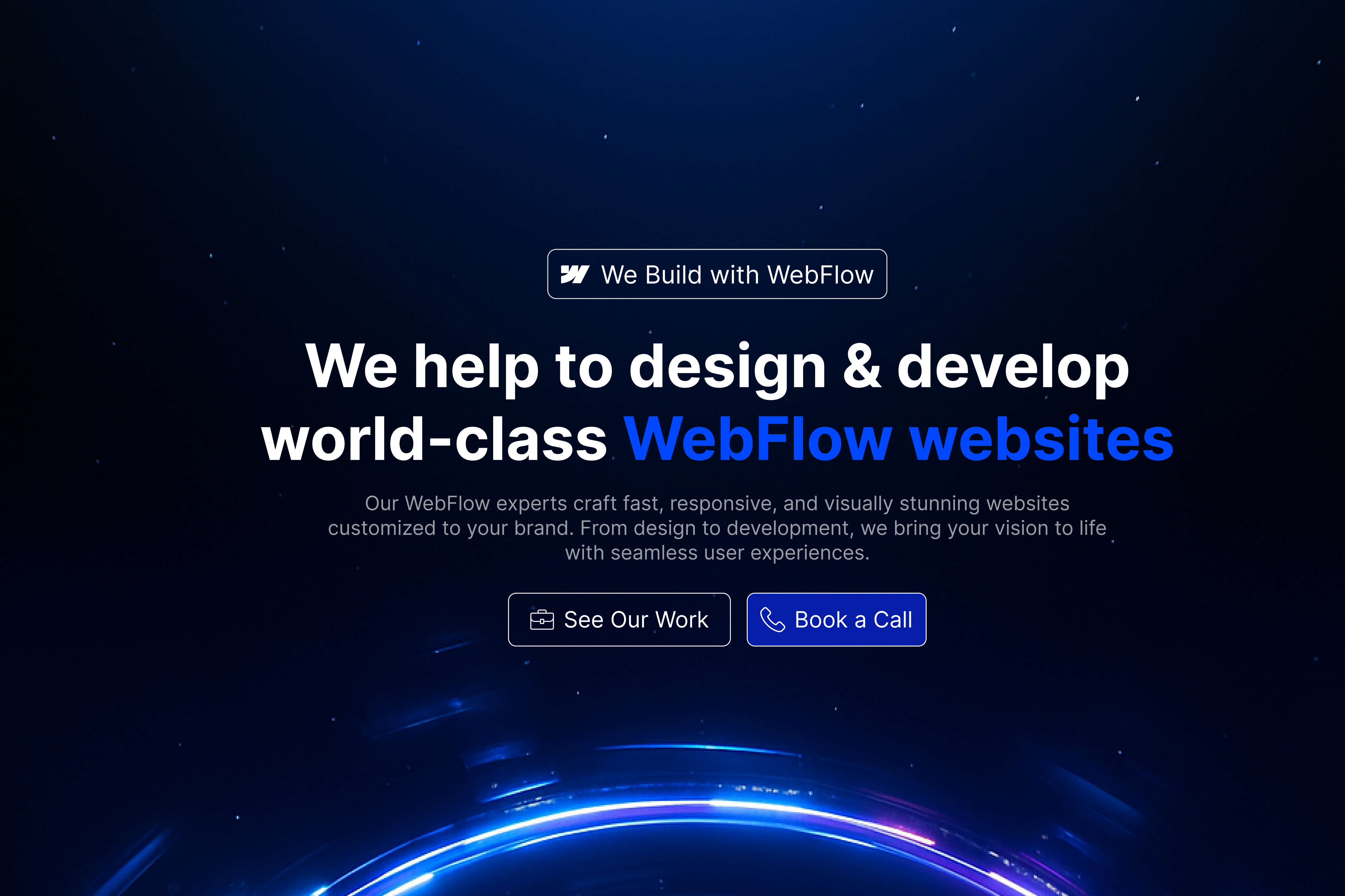
This futuristic Webflow agency hero section is designed for digital studios, Webflow development teams, no-code agencies, UI/UX professionals, and independent experts who want to present their services with authority from the first moment a visitor lands on the website. It combines a dark visual atmosphere with glowing blue accents, subtle space-inspired details, bold typography, and carefully placed conversion elements.
The design creates an immediate impression of technical capability, modern thinking, and premium digital craftsmanship. Rather than relying on a plain corporate layout, the hero section uses depth, light, and contrast to make the agency feel more advanced and memorable. It is particularly effective for businesses that want their website to communicate innovation without making the interface difficult to understand.
Every part of the composition has a clear role. The Webflow badge introduces the platform specialisation, the headline explains the main service, the supporting paragraph adds context, and the two call-to-action buttons guide visitors towards the next step. The result is a visually impressive hero section that still remains focused on clarity and lead generation.
Clear Positioning from the First Screen
A strong agency website should quickly answer three questions: what the company does, who the service is for, and what the visitor should do next. This hero section communicates those points through a simple and direct structure.
The main headline positions the business as a Webflow design and development partner. The phrase “Webflow websites” is highlighted in bright blue, making the agency’s area of expertise instantly visible. Visitors do not have to scroll through several sections or read a long introduction to understand the service.
This direct positioning is especially useful for agencies working in a competitive market. Many creative businesses use broad statements such as “We build digital experiences” or “We transform ideas into reality.” Although those phrases may sound professional, they often fail to explain the actual service. This hero section takes a more practical approach by clearly presenting the company as a team that designs and develops high-quality Webflow websites.
The wording can be adapted for different specialisations, including Figma-to-Webflow development, SaaS website design, Webflow migration, landing page development, conversion-focused redesign, or ongoing Webflow support.
Futuristic Visual Direction
The visual identity is one of the strongest features of this component. The deep navy and black background creates a premium environment, while the electric-blue glow gives the section a modern technological character. Small star-like particles are distributed across the background to add dimension without distracting from the content.
At the bottom of the design, a glowing circular shape appears to rise into the viewport. This element creates movement and visual depth, making the layout feel more immersive than a standard flat hero section. It can represent a digital horizon, a new world, an energy field, or the beginning of a new online experience.
This style works particularly well for agencies that want to appear innovative, ambitious, and forward-thinking. It can also support brands working with technology companies, SaaS products, artificial intelligence platforms, cybersecurity firms, fintech products, or digital transformation projects.
Despite the dramatic background, the content remains easy to read because the typography is placed in a clean central area. The visual effects support the message rather than competing with it.
Strong and Focused Typography
The headline uses large, bold typography to establish a strong visual hierarchy. White text provides maximum contrast against the dark background, while the blue highlighted words direct attention towards the most important service keyword.
The headline is divided across two lines, which makes it easier to scan and gives the message more visual balance. The wording is confident but not overly complicated. It explains both the creative and technical sides of the service by including “design” and “develop” in the same statement.
Below the headline, a shorter supporting paragraph provides additional context. It communicates that the agency creates responsive, visually polished, and customised websites. This text helps the visitor understand that the service is not limited to visual design. It also includes development quality, usability, and performance.
The paragraph is intentionally narrower than the headline, creating a clear reading path from the main promise to the supporting explanation. This structure helps visitors process the information quickly, which is essential for a high-performing landing page.
Platform Credibility Through the Webflow Badge
The small badge above the headline reinforces the agency’s platform expertise. It includes the Webflow symbol and a short phrase that confirms the team builds websites using Webflow.
This element serves several purposes. First, it acts as a visual label that introduces the subject of the section before the visitor reaches the main headline. Second, it adds credibility by showing a clear connection to a recognised website development platform. Third, it helps the design feel more specialised rather than generic.
The badge can be customised to support different messages. For example, an official Webflow Partner could display its partner status. A development agency could use wording such as “Built with Webflow.” A specialised team could write “Webflow Experts,” “Figma to Webflow,” or “Enterprise Webflow Development.”
It can also be adapted for other platforms or services while keeping the same visual style.
Two Clear Conversion Paths
The hero section includes two call-to-action buttons, each designed for a different type of visitor.
The first button invites users to view the agency’s work. This is ideal for visitors who are interested but still need proof of quality before making contact. It can lead to a portfolio, selected case studies, a project gallery, or a dedicated work page.
The second button encourages visitors to book a call. This is a stronger conversion action for potential clients who already understand the service and want to discuss a project. The blue background gives this button greater visual priority, making it the primary action within the section.
This two-button structure creates a balanced customer journey. Visitors who are not ready to contact the agency can explore previous work, while high-intent prospects can immediately schedule a consultation.
The labels can be changed depending on the agency’s sales process. Alternatives may include “View Case Studies,” “Start a Project,” “Get a Quote,” “Book a Discovery Call,” or “Discuss Your Website.”
Built for Premium Webflow Services
This hero section is particularly suitable for agencies that position themselves in the mid-range or premium segment of the market. The visual style suggests quality, attention to detail, and advanced digital capability.
It can support a wide range of Webflow services, including custom website design, responsive Webflow development, CMS implementation, animation, interaction design, website migration, technical SEO, accessibility improvements, performance optimisation, and ongoing support.
The layout also works well for studios that offer a complete project process. The headline can introduce the core service, while the sections below can explain strategy, research, wireframing, UI design, development, quality assurance, launch, and post-launch maintenance.
Because the hero section communicates both design and development, it is ideal for teams that want to present themselves as a complete digital partner rather than only a design studio or development supplier.
Responsive and Mobile-Friendly Structure
The centred composition makes the hero section straightforward to adapt across different screen sizes. On desktop displays, the wide headline and background effects create a cinematic experience. On tablets, the content can remain centred while the headline scales down to maintain readability.
For mobile devices, the text can be divided into shorter lines, and the two buttons can be stacked vertically. The glowing circular artwork can be repositioned or reduced so that it continues to support the design without taking too much vertical space.
The supporting paragraph should also use a comfortable line length to avoid dense blocks of text on small screens. Proper spacing between the badge, headline, paragraph, and buttons will ensure that the hierarchy remains clear.
The responsive version should preserve the visual identity of the original component while prioritising usability and tap-friendly interaction.
Easy to Customise for Different Brands
Although the component uses a futuristic blue visual direction, it can be customised for many brand identities. The blue highlights can be replaced with purple, green, cyan, orange, or another brand colour. The background can include gradients, abstract shapes, animated lines, soft light effects, or a branded illustration.
The central structure can remain the same while the message and visual styling are adjusted. Agencies can replace the Webflow badge, edit the headline, change the paragraph, update the button labels, and connect the calls to action to relevant pages.
The glowing circular graphic can also be modified to match a specific industry. A cybersecurity company could use a digital grid, a SaaS business could use a dashboard preview, and a creative agency could use a three-dimensional abstract object.
This flexibility makes the component useful as both a ready-made design and a foundation for more customised website experiences.
Suitable for Multiple Business Types
While the section is designed around a Webflow agency, its layout can be used for several related businesses. It is suitable for no-code studios, software design agencies, SaaS website specialists, digital product teams, creative developers, conversion agencies, freelance Webflow experts, and technology consultancies.
It can also be adapted for businesses that build Framer websites, Shopify stores, WordPress platforms, or custom-coded digital products. The platform badge and headline can be replaced while the overall visual hierarchy remains effective.
The component is most appropriate for businesses that want to appear modern and technically capable. It may be less suitable for brands that require a soft, traditional, or highly minimal visual identity, unless the background and lighting effects are customised.
Designed to Build Trust and Generate Leads
A successful hero section should do more than look attractive. It should help visitors understand the offer, trust the business, and move towards a meaningful action.
This component supports those goals by combining specific platform positioning, a clear service promise, concise explanatory text, and two conversion options. The visual quality creates a premium first impression, while the content structure keeps the experience practical and easy to navigate.
The portfolio button provides a path for visitors who need evidence. The booking button creates a direct route for qualified prospects. Additional trust elements can be placed below the hero, such as client logos, project statistics, testimonials, awards, Webflow certifications, or review scores.
Together, these elements can turn the hero section into the beginning of a complete agency conversion funnel.
Search-Friendly Content Structure
The headline naturally includes valuable service-related terms such as Webflow design, Webflow development, and Webflow websites. These terms can help search engines understand the purpose of the page when they are used naturally within the wider website content.
The supporting paragraph can include location, audience, or service-specific language where appropriate. For example, an agency could describe itself as a Webflow development partner for SaaS companies, startups, or professional service businesses.
The content should remain written for people first. Repeating keywords excessively would reduce quality and make the message feel unnatural. A better approach is to support the hero with detailed service sections, case studies, process information, FAQs, and relevant internal links.
The visual heading should also be implemented as the primary H1 heading, while the buttons should use clear and descriptive labels.
A Flexible Starting Point for an Agency Website
This hero section provides a strong foundation for a complete Webflow agency website. It introduces the brand, communicates the service, and creates a clear transition into the sections below.
After the hero, the website could continue with selected client logos, featured projects, service categories, the agency process, performance statistics, testimonials, team information, and a final consultation call to action.
The visual style can also be extended throughout the site using blue gradients, thin borders, glowing interface elements, dark cards, subtle motion, and consistent typography. This creates a connected brand experience rather than a hero section that feels separate from the rest of the website.
For agencies that want to appear confident, modern, and highly specialised, this component offers a clear and visually distinctive starting point. It combines futuristic aesthetics with practical content hierarchy, making it suitable for both portfolio presentation and client acquisition.