Resume Builder Hero Section for SaaS Landing Page | Modern CV Builder UI
Design a Resume Builder SaaS Hero Section Faster
Designing a strong hero section from scratch often takes more time than expected. You need to decide the layout, visual hierarchy, headline placement, navigation structure, button style, color direction, product preview, spacing, and responsive behavior. For UI UX designers and frontend developers, repeating the same process for every project can slow down the entire workflow.
This Resume Builder SaaS Hero Section gives designers and developers a ready made starting point for creating a modern resume builder website. Instead of spending hours planning the first screen, you can use a complete hero layout that already includes navigation, headline content, supporting text, feature highlights, call to action buttons, and a product interface preview.
The component is especially useful for resume builder platforms, CV creator tools, career websites, job application software, portfolio builders, recruitment products, and other SaaS landing pages related to professional growth.
A Ready Made Hero Section for Figma Projects
The hero area is usually the most important section of a SaaS landing page. It introduces the product, explains its value, and guides visitors toward the primary action. Because this section carries so much responsibility, designers often spend a significant amount of time refining it.
This Figma hero section component helps reduce that design time.
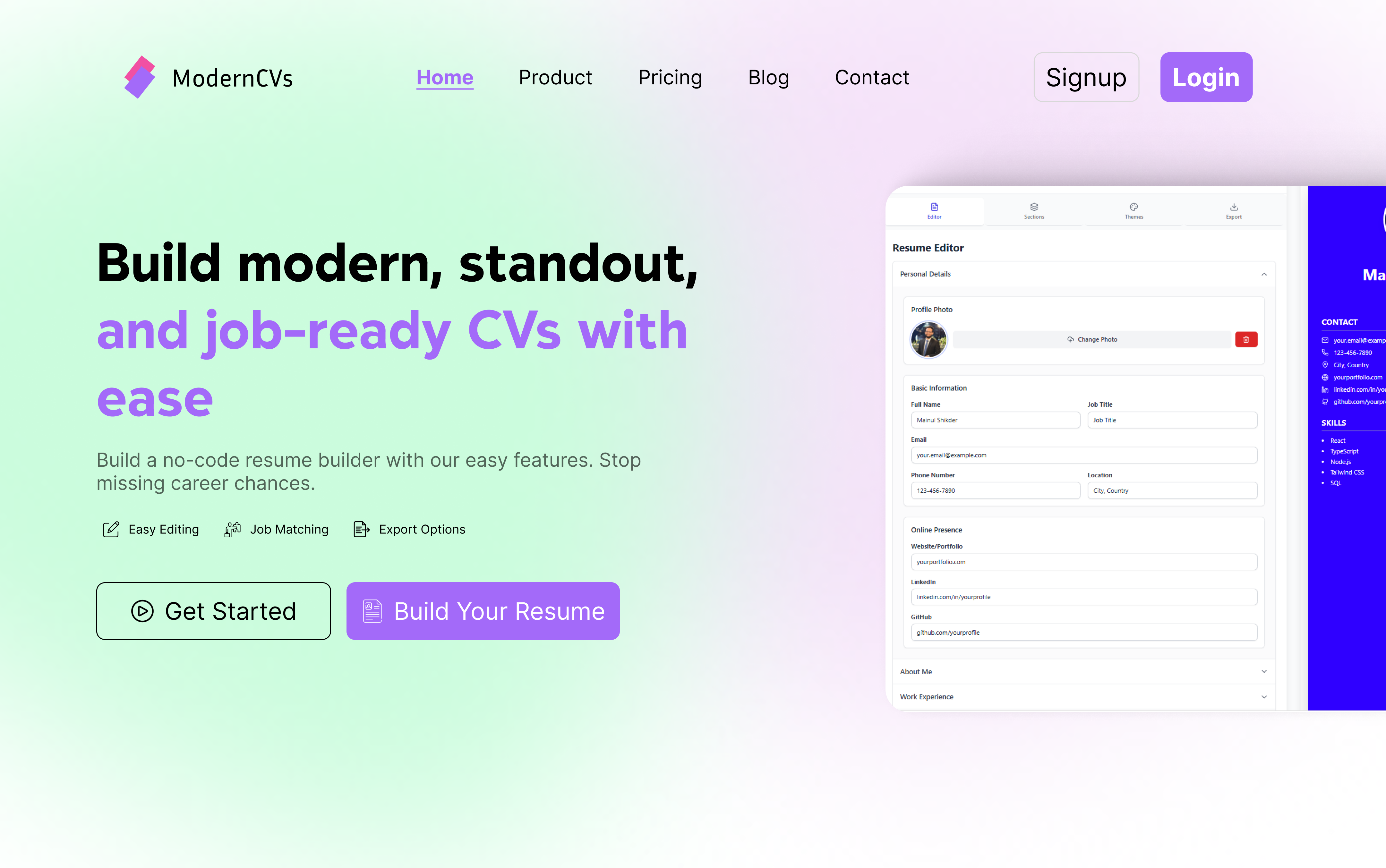
The layout already has a clear structure. The left side focuses on product messaging and conversion content. The right side displays a resume editor interface, helping visitors understand the product immediately. The navigation and action buttons complete the overall SaaS landing page experience.
Designers can quickly replace the logo, headline, description, feature text, button labels, colors, and product screenshot. The component can then be adapted to match a specific brand or client project.
It works as a practical foundation rather than a fixed final design.
Built for UI UX Designers
UI UX designers often need to create multiple landing page concepts within a short deadline. Starting every hero section from an empty frame can make this process repetitive and inefficient.
This component provides a complete visual direction from the beginning.
The designer can focus on customization instead of basic layout planning. Typography, spacing, button placement, content alignment, and product preview positioning are already organized. This makes it easier to explore different branding styles without rebuilding the entire composition.
The design can be used for personal projects, client work, design challenges, startup concepts, portfolio case studies, and marketplace templates.
It is also useful for designers who want to study how a modern SaaS hero section is structured. By exploring the component, they can understand how visual hierarchy guides attention from the headline to the supporting text and then toward the primary call to action.
Helpful for Frontend Developers
Frontend developers also benefit from using a structured hero section reference.
When a clear Figma design is available, developers can build the section faster using HTML, CSS, Tailwind CSS, React, Next.js, Vue, or any preferred frontend technology. The layout already communicates the expected content order, responsive structure, spacing, and user flow.
The design includes common SaaS interface elements such as a navigation bar, signup button, login button, main headline, short description, feature highlights, action buttons, and dashboard preview.
Developers can convert these elements into reusable components and use them across similar landing page projects.
This saves time during both development and communication. Instead of discussing every layout decision separately, the team can use the Figma hero section as a visual reference.
Perfect for Resume Builder SaaS Websites
The component is designed around a resume builder product, making it ideal for websites that help users create professional CVs and job application documents.
The visual preview on the right clearly represents a resume editor. This gives the hero section a strong product focused appearance. Visitors can understand that the website offers resume editing and CV building tools without needing to read a long explanation.
Designers can use this layout for products such as online resume builders, CV generators, cover letter creators, job search platforms, career planning tools, portfolio builders, professional profile creators, and recruitment software.
The same layout can also be adapted for different SaaS niches by replacing the interface preview and rewriting the content.
For example, the resume editor screenshot can be replaced with a dashboard, analytics panel, project management interface, AI writing tool, marketing platform, or finance application.
This flexibility makes the component useful beyond one specific industry.
Create a Strong First Impression
A hero section needs to communicate value within a few seconds.
Visitors should quickly understand what the product does, why it matters, and what action they should take next. A weak hero section can make even a good product feel confusing. A strong hero section makes the website look more professional and trustworthy.
This template uses a simple structure to create that clarity.
The headline introduces the main product benefit. The highlighted text adds visual emphasis. The short description explains the product in a direct way. Small feature items support the message with additional details. The call to action buttons encourage visitors to explore the product. The interface preview adds visual proof.
All of these elements work together to create a focused and conversion friendly first screen.
Clean and Modern Visual Style
The design uses a soft gradient background with a combination of green, pink, purple, and white tones. This creates a modern SaaS appearance while keeping the content readable.
The large headline gives the section a clear focal point. Purple highlight text adds contrast and helps important words stand out. Rounded buttons make the interface feel friendly and accessible. The product preview introduces depth and gives the layout a more realistic presentation.
The overall design style can work well for startup websites, AI tools, productivity platforms, career products, and technology companies.
Designers can easily adjust the visual direction by changing the colors, font family, border style, button radius, and background treatment.
A few small changes can transform the component into a minimal, bold, corporate, playful, or premium hero section.
Easy to Customize in Figma
A useful Figma component should not only look good. It should also be easy to edit.
This hero section is structured so designers can quickly update the most important elements. The text can be replaced with new product messaging. The buttons can be renamed based on the website goal. The navigation links can be changed to match the sitemap. The logo can be replaced with a brand identity. The product image can be updated with a new dashboard or application screen.
Colors can also be adjusted to match a design system.
For example, a designer can replace the purple accent with blue for a more corporate look, orange for a more energetic style, or green for a career focused brand. The gradient background can be simplified into a solid color or replaced with a subtle pattern.
The component can also be turned into multiple variations for desktop, tablet, and mobile layouts.
Improve Your Landing Page Workflow
Using reusable components is one of the easiest ways to improve design speed.
Instead of recreating common website sections for every project, designers can build a library of ready made components. Hero sections, feature sections, pricing tables, testimonials, navigation bars, footers, and call to action blocks can all be reused and customized.
This Resume Builder SaaS Hero Section can become part of that design system.
When a new resume builder or career platform project begins, the designer already has a strong first section ready. The layout can be duplicated, customized, and presented to the client much faster.
This also helps maintain consistency across projects. Common spacing rules, typography scales, button styles, and content structures can be applied more easily.
For freelance designers, this can reduce project delivery time. For design teams, it can improve collaboration. For developers, it can make implementation more predictable.
Useful for Client Presentations
Clients often find it difficult to understand a website idea from text alone.
A complete hero section helps them visualize the final product. They can see how the logo, navigation, value proposition, action buttons, and software interface will appear together.
This makes design presentations more effective.
The designer can replace the placeholder content with the client brand and create a polished landing page concept within a short time. The client can then give feedback on a realistic visual instead of discussing abstract ideas.
Because the hero section already looks complete, it can make an early design presentation feel more professional.
Suitable for Figma Template Creators
Figma template creators can also use this component as part of a larger SaaS landing page kit.
The hero section can be combined with other sections such as features, how it works, template gallery, customer reviews, pricing, frequently asked questions, call to action, and footer.
Together, these sections can form a complete resume builder website template.
Template creators can also produce multiple versions using different typography, colors, dashboard previews, and content styles. This makes the product more valuable for designers who need variety.
The component can be included in UI kits, website templates, design systems, startup landing page collections, and SaaS design resources.
Create Responsive Versions Faster
Modern websites need to work well across desktop, tablet, and mobile devices.
This hero section provides a strong desktop layout that can be adapted into responsive versions. On smaller screens, the navigation can be simplified, the content can be centered, the buttons can be stacked, and the product preview can be placed below the text.
The desktop two column layout can become a single column mobile layout.
Because the content hierarchy is already clear, responsive adaptation becomes easier. The headline remains the primary focus, followed by the description, features, buttons, and product preview.
Developers can use the same structure when building responsive breakpoints.
Designed for Better Conversion
A good hero section should guide visitors toward one main action.
This design includes two call to action buttons. The primary button can be used for actions such as Start Building, Create Resume, Get Started, or Try for Free. The secondary button can be used for Watch Demo, View Templates, Explore Features, or Learn More.
The visual contrast between the buttons helps visitors identify the primary action.
The feature highlights also reduce uncertainty. Short items such as Easy Editing, Job Matching, and Export Options communicate useful product capabilities without adding too much text.
The product preview supports the message by showing what users can expect after clicking the button.
For designers, this creates a balanced hero section that combines visual appeal with practical conversion principles.
A Flexible Component for Multiple SaaS Niches
Although the example focuses on a resume builder, the structure can support many different SaaS products.
A designer can replace the resume editor with a relevant interface and adapt the content for an AI writing tool, project management platform, email marketing software, finance dashboard, analytics product, online course platform, CRM system, HR platform, or productivity application.
The same layout remains effective because it follows a common SaaS landing page pattern.
This makes the component a flexible resource for both designers and developers.
Instead of creating a new hero section for every niche, they can reuse the same foundation and adjust the branding, product preview, and messaging.
Save Time Without Sacrificing Quality
Speed is important, but quality still matters.
A ready made component should help designers move faster while maintaining a professional result. This hero section offers a clear layout, modern visual style, strong content hierarchy, and realistic product presentation.
It removes the repetitive early stage work and gives the designer more time to focus on brand identity, user experience, and creative details.
Developers can also spend less time interpreting incomplete layouts and more time building a clean, responsive interface.
Whether the project is a client website, startup concept, portfolio piece, SaaS template, or frontend practice project, this component provides a reliable starting point.
Conclusion
The Resume Builder SaaS Hero Section is created for designers and developers who want to build modern landing pages faster.
It provides a complete first screen with navigation, headline content, feature highlights, call to action buttons, gradient styling, and a resume editor preview. Every element can be customized in Figma and adapted to match different brands or SaaS products.
UI UX designers can use it to speed up their design process. Frontend developers can use it as a clear implementation reference. Freelancers can use it for client projects. Template creators can include it in larger website kits. Startup teams can use it to quickly visualize a resume builder or career platform.
Instead of starting from an empty frame, you can begin with a polished structure and focus on customization.
This helps you design faster, present ideas more clearly, and create a professional SaaS hero section with less effort.